§ 01 · Overview
Doc's Diesel had strong products and traffic, but a storefront that made mobile shoppers work too hard. 90% of visitors arrive on a phone, need to know a part fits their truck, and then need a reason to trust the store. The site answered those questions late, or in the wrong place.
I set the direction for the storefront and run it as a product. I decide what to fix based on the funnel data, design the solution in Figma, build it in the Shopify theme, and prove it with A/B tests. I also lead the outside partners for development, site search and CRO research, so their work lines up with the same plan.
§ 02 · Goals
Fix the mobile storefront where it leaks
Find where shoppers get stuck in navigation and on the product page, and redesign those moments first.Prove every change with data
Ship big changes as A/B tests or measured launches, and report what actually moved, including what didn't.Give the team a faster way to ship
Replace one-off asset work with a design system and tools, so content and tests stop waiting on production.
§ 03 · My role
I own the storefront end to end. UX strategy, interaction and visual design, the front-end build in Shopify, the experimentation program, and the partners for development, search and CRO research.
§ 04 · Team
Ecommerce, marketplace and marketing teams in-house. ConversionFlow for CRO research, plus partners for theme development, site search and A/B testing, all coordinated by me. I design in Figma and build in Shopify Liquid myself.
§ 05 · The opportunity
The opportunity
Truck owners know exactly what they need. What they don't know is whether a part fits their truck, and whether this store is worth trusting over Amazon. On a phone, the old storefront made them dig for both answers.
I looked at the whole funnel and picked the two places where fixing friction would pay off most: the navigation, where shoppers decide where to go, and the product page, where they decide to buy. Everything else in this case supports those two bets, including the tools that let the team move fast enough to test them.
§ 06 · Navigation redesign
Navigation redesign
The problem. Customers were using site search as their menu. They typed "track order", "military discount", "rewards", "returns" and "promo code", because the menu followed the internal catalog instead of the words customers use. Support felt it too: order-status questions made up 41.8% of all tickets.
The research. I ran 9 user tests with ConversionFlow, our CRO partner, and studied Microsoft Clarity heatmaps of the mobile homepage. Three findings shaped my direction:
- Everyone shops vehicle-first. All 9 testers started with their truck. The Year, Make and Model dropdowns were the 4 most-tapped elements on the mobile homepage.
- The menu was the fallback. The hamburger was only the 5th most-tapped element, with 4,191 taps.
- The footer was invisible. 72% of visitors never scrolled near it, and that's where order tracking, returns and support lived.
The call. I prototyped two directions, vehicle-first and job-first, and chose job-first. The vehicle selector already did the vehicle-first job well. The menu's job was everything else: orders, rewards, discounts and help. Duplicating the selector would have added depth without removing a single search.
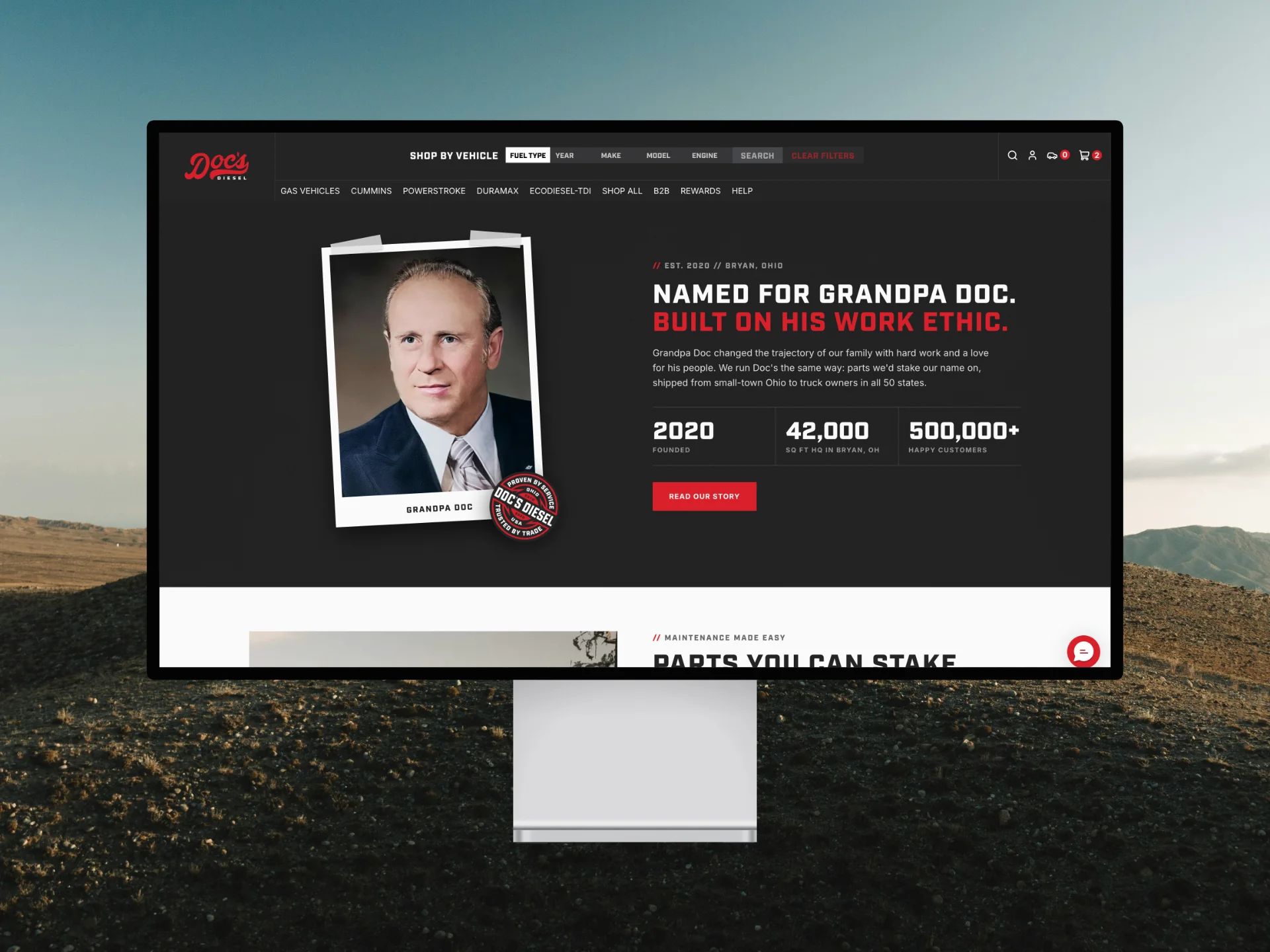
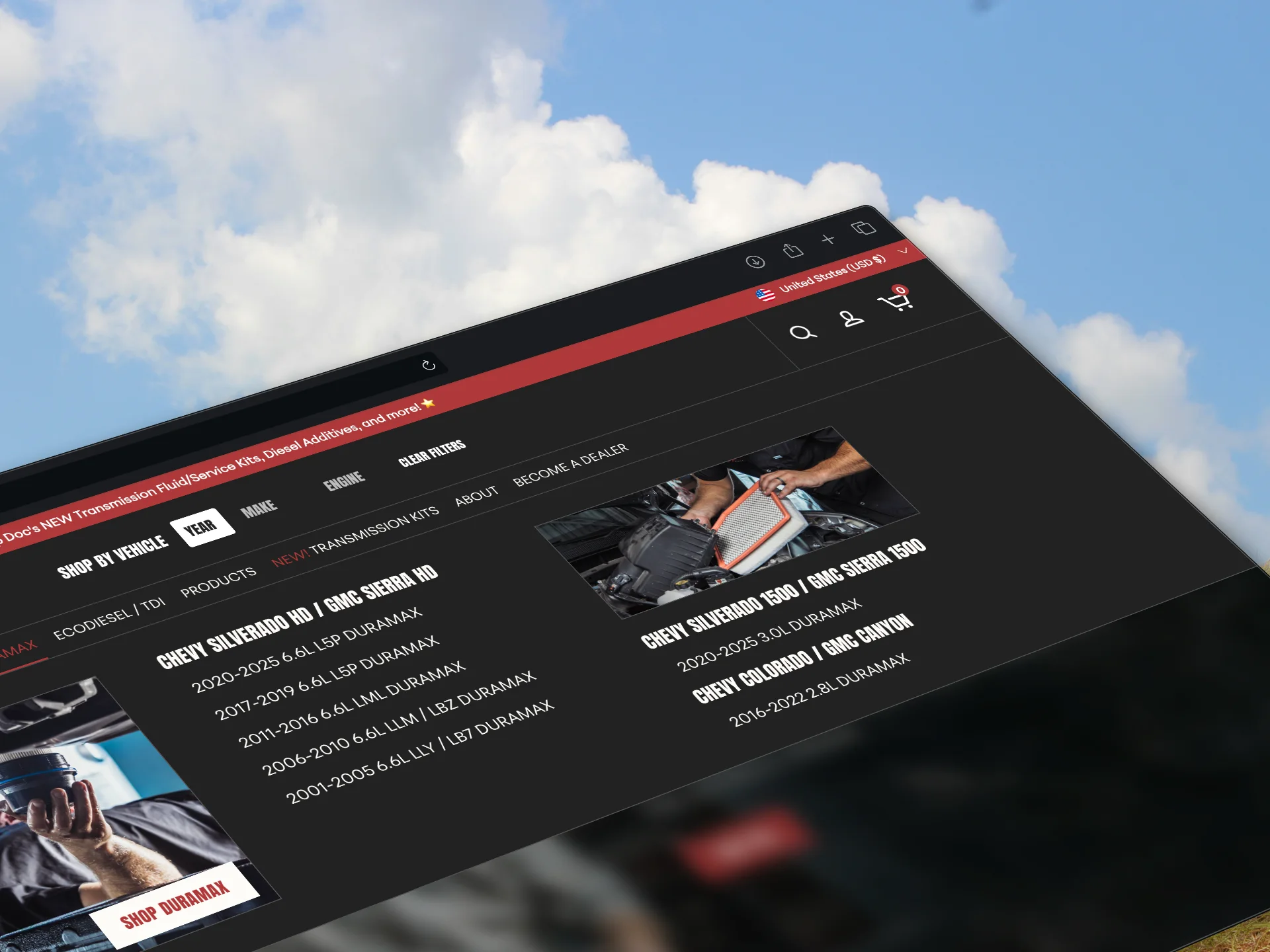
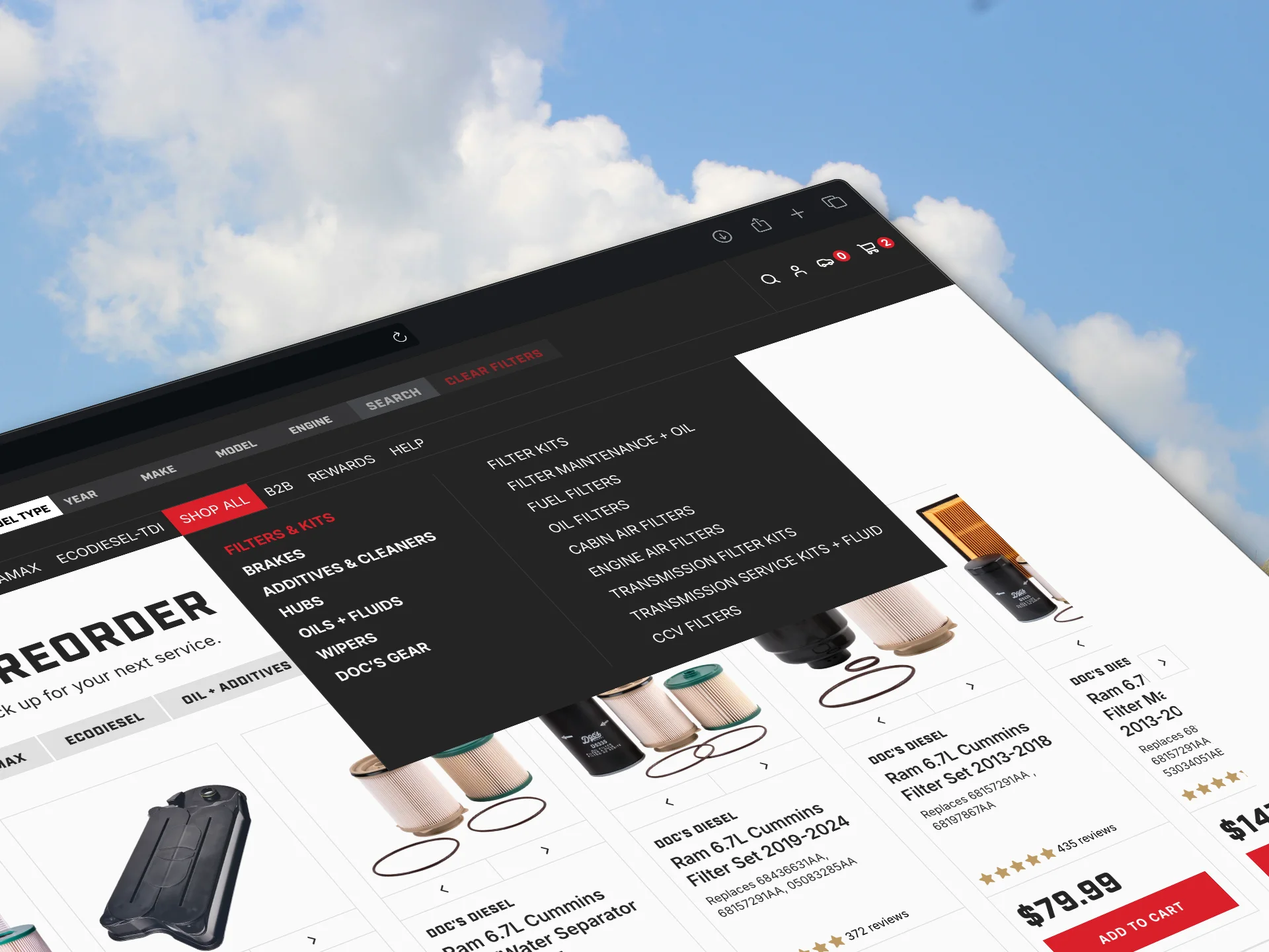
What shipped. A mobile-first menu organized by what customers come to do. New Rewards and Support menus bring orders, discounts, returns and help out of the footer, one tap from anywhere. The Diesel and Gas toggle stays at the top, and the shop-by-vehicle menu keeps the catalog one step away.
§ 07 · Navigation results
Navigation results
Measured over 30 days before and 30 days after launch (July 7 to August 5, against August 6 to September 4):
- Mobile conversion rate went from 2.40% to 2.64%, up 9.9%
- Mobile revenue per visitor went up 12.4%
A before and after read has no control group, so I treat it as a strong signal, not a precise number. That's why I moved every storefront change after it onto proper A/B tests.
§ 08 · Product page redesign
Product page redesign
The problem. New mobile visitors couldn't see the three things that make them buy: proof the part fits their truck, proof the store is trustworthy, and the value of subscribing. All of it sat too low on the page. The subscription block listed generic benefits ("save money, free shipping, cancel anytime") that didn't say what a subscriber actually gets.
The military discount showed what was at stake. Military buyers converted at over 54% once they found their offer, but most never found it.
The research. An audit with ConversionFlow across 23 data sources, from analytics and heatmaps to the user tests.
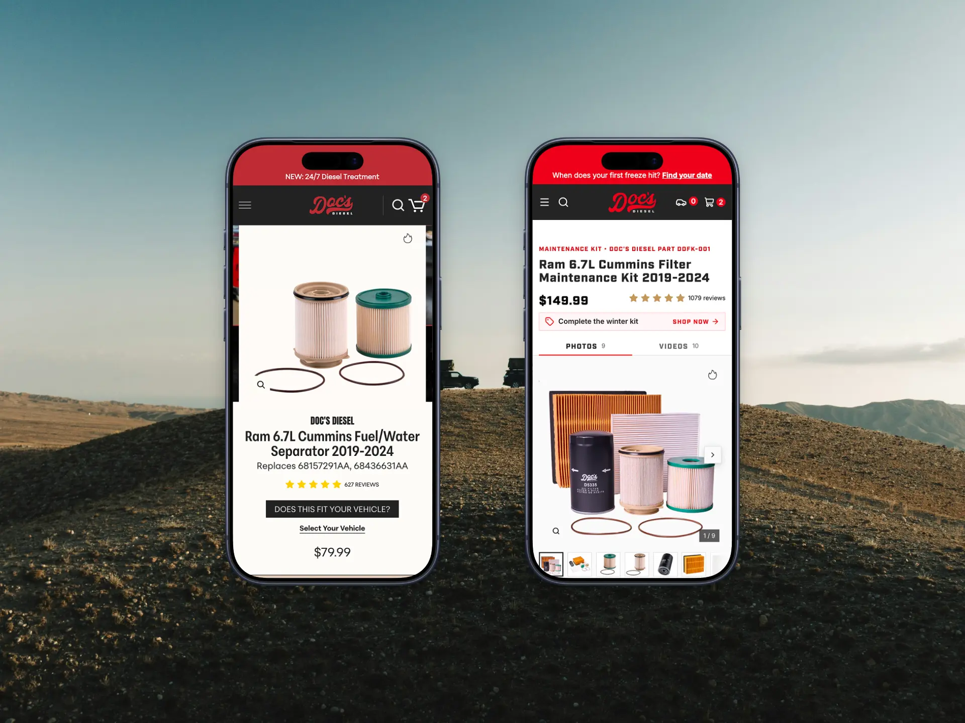
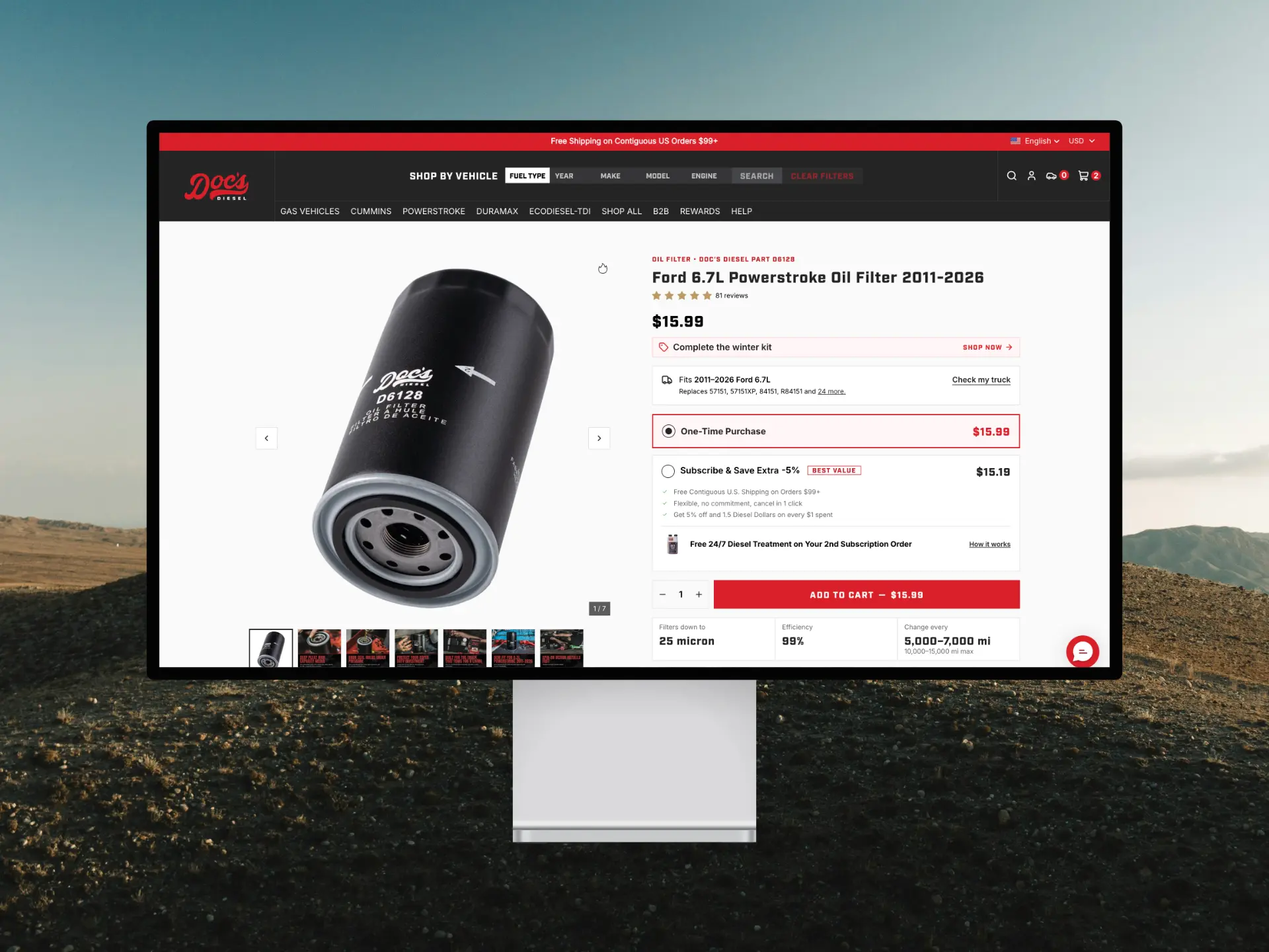
What I changed. I rebuilt the buying zone at the top of the page around those three questions:
- Fitment confirmation moved up, next to the price
- Star ratings moved to the top right, where shoppers look for them
- The add to cart button went from red to black and shows the sale price against a strikethrough
- Subscription copy that names the value: "5% off and 1.5 Diesel Dollars on every $1 spent"
- A text list of benefits became an icon trust strip, with a separate Veterans and Heroes block for the military offer
- A sticky add to cart bar on mobile
The test. A 50/50 A/B test in Intelligems over 29 days, with 350,265 visitors.
§ 09 · Product page results
Product page results
- Subscription selections went from 0.44% to 0.61% of visitors, up 37.2% (95% confidence interval: +24.8% to +50.5%)
- Daily military discount verifications nearly tripled
- Review clicks went up 6.6%
Overall revenue per visitor held flat (+0.3%, not significant). The win is in the subscription mix, and subscribers come back to reorder.
What the test taught me. The new layout pushed the native add to cart button lower, so the sticky bar rarely triggered. I'm fixing that in the next round rather than calling the test a full win.
The follow-up. I ran a trust messaging test with four variants. A bento layout won, with revenue per visitor +5.1% and add to cart +3.1%, at 93% probability to beat control. An accordion layout lost 5.6% conversion, and I switched it off.
What's next. I'm folding 41 product page templates into 3, so every winning change ships to the whole catalog at once instead of template by template.
§ 10 · Systems behind the speed
Systems behind the speed
A testing program only works if the team can produce changes quickly. So before scaling the storefront work, I built the infrastructure under it.
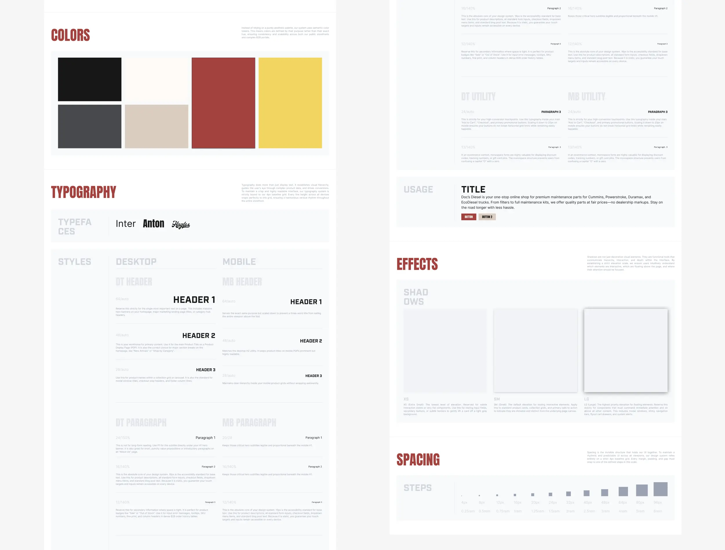
- Design system. A Figma component library and design tokens, mirrored as CSS variables in the Shopify theme, so design and code change together. A promo asset set went from a full workday to about an hour, 87% less time. Building sections in-house on top of it cut outsourced development hours by about half.
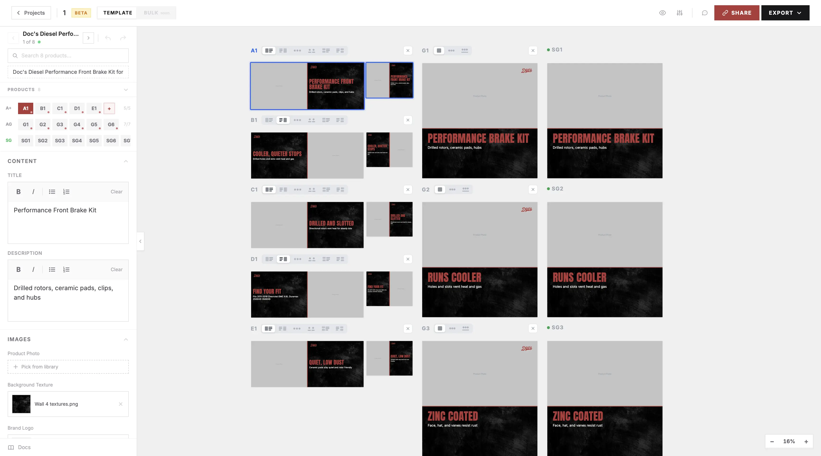
- Design Generator. A Next.js app I designed and built. Upload a CSV of products and it lays out marketplace and storefront listing images in bulk, with AI-written copy for review. The marketplace team adopted it as their standard tool.
- Kit image pipeline. A new product line needed images for thousands of kit SKUs, and manual work topped out at 30 a day. I designed an AI pipeline with references, generated scenes and cutouts, and trackers. It produced 120 images in one day, scales to 1,500 kits, and became the standard process for the outside creative agency.
§ 11 · Also shipped
Also shipped
- Conversion program. When the outside CRO agency left, I set up the testing program in-house: weekly conversion and error reports, a 90-day funnel analysis, and a brief with a hypothesis and measurement plan for every test. 33 weekly diagnoses so far caught a checkout leak, a broken cart script, and out-of-stock pages still getting paid traffic.
- Discount popup. A redesign lifted email signups 29% in a 14-day split test. It now runs for all traffic.
- B2B dealer page. A lead-generation page tied to the dealer portal sign-up. It has brought a steady stream of new wholesale signups since launch.
- Brand story page. A page about the family behind the name, shaped by a review of 14 competitor brands.
- Gas launch. The site work for a new gas product line, including moving Gas Vehicles to the first spot in the menu.
- Content scheduling. Shopify metaobjects with date-range scheduling replaced hand uploads to every template. Hours became minutes.
- Homepage test. Running now. Early reads: conversion +2.4%, subscription revenue per visitor +27%.
"B2B Catalog & new web page looking amazing."
Max Nihart, CEO, Doc's Diesel
§ 12 · Results
Results
Each number comes from an A/B test or a 30-day before and after read. The homepage test is still running, so it isn't charted.
- Subscription selections, share of visitors +37%
- Mobile conversion rate +9.9%
- Time to produce a promo asset set −87%
- Mobile revenue per visitor +12.4%
- Email signups from the discount popup +29%
- Revenue per visitor, trust messaging winner +5.1%
- Daily military discount verifications ~3×
- Outsourced development hours ~−50%
| Work | Method |
|---|---|
| Product page redesign | A/B test, 50/50, 29 days, 350,265 visitors |
| Trust messaging | A/B test, 4 variants, 93% probability to beat control |
| Navigation redesign | 30 days before vs after launch, no control group |
| Discount popup | Split test, 14 days |